


On This Page Show
Minecraft is a game with a ton of different colored blocks to choose from, and the game seems to keep adding more and more every year via updates.
With so many blocks available at our disposal, it becomes hard to develop unique and creative block pallets that look distinct and, most importantly, look good!
For that reason, this entry was created. This blog will help our fellow builders choose the best block pallets in Minecraft and how to increase their looks with a few simple tricks.
We’ll also give you many different examples to choose from, and start building your own vases with these new block palettes. So with that out of the way, let’s get into it!
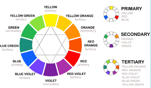
Color theory in general
The color theory might sound like a fancy term, but it doesn’t have to. I’m not an art major, but I still manage to take help from this wheel of colors given above. You can see which colors go with which color when you look at this wheel of colors.
It is quite evident that you’ll have to choose colors opposite to each other in the wheel for a striking contrast; but know this will look very vivid and should be reserved only for exceptional scenarios as these contrasting colors will look really harsh, which is really hard on the eyes and doesn’t look that great.
Instead, try using colors that are near each other.
So, for example, try going with colors like blue and blue-violet when choosing two colors for a wall instead of red and blue. You can also add three fours colors to the same wall, making the build more diverse and looking better.
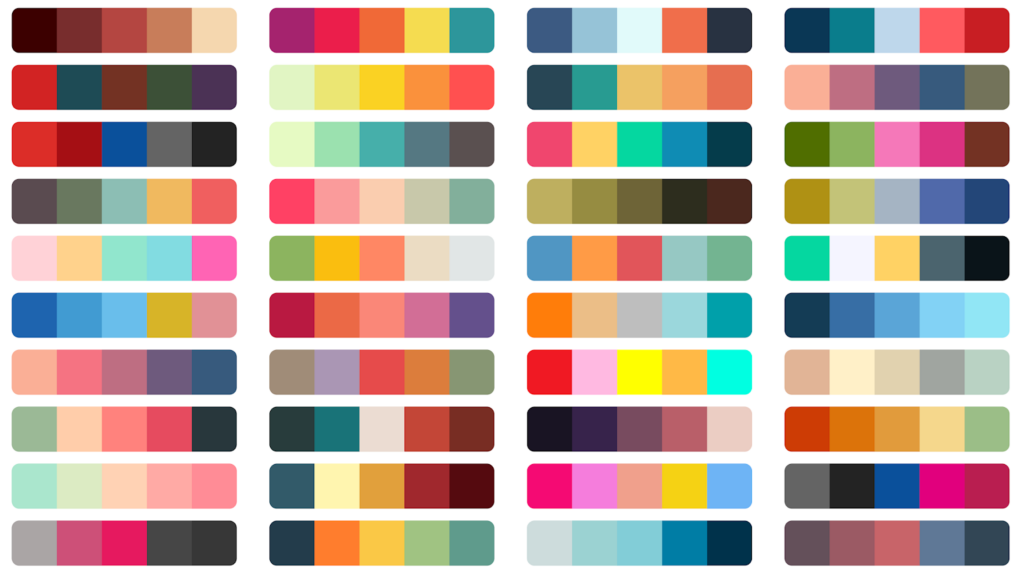
Use the random color palette generator
Suppose you’re having a hard time thinking about color combos. In that case, you can simply visit the internet for help, just type a random color palette generator, and tons and tons of sites will pop up, giving you a lot of different color combinations.
These sites are perfect for builders, especially when the creative juices don’t seem to be flowing and you can’t think of anything.
Above, we’ve given a color palette chart; now, you won’t find every color block shown above in Minecraft, but that’s where the color palette ends, and your creativity begins; you’ll have to look for alternatives that are closer to the original palette, these color combos will only give you a little boost!
Texture the walls!
Before we move on to a real example for Minecraft. One last point has to be made, and it probably is one of the most important ones. When choosing a color palette, many players only look for a color for the walls and a color for the roofs, this isn’t wrong, but there’s so much more than you can do in Minecraft.
You can start by adding texturing the wells of your builds and roofs.
This effect is achieved by using blocks that have very similar colors; this makes the build a little more realistic, and it looks awesome to look at; after you add details to this textured build, you’ll have the best build!
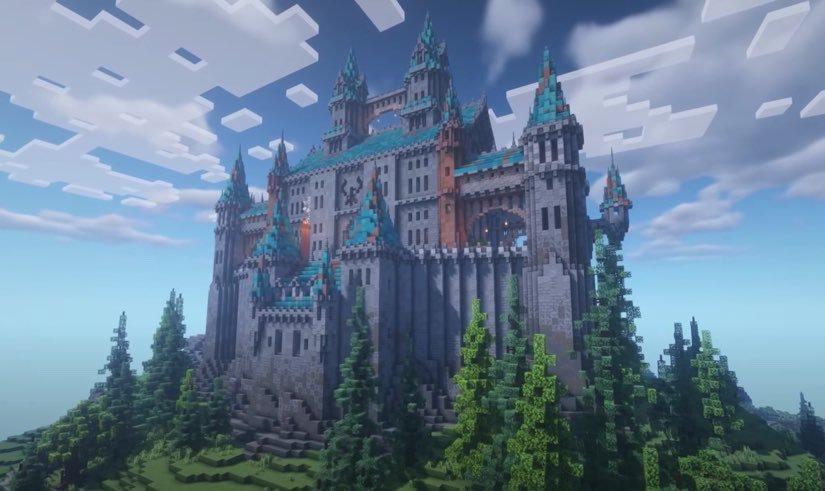
For inspiration, take a look at the castle above and how the builder has managed to texture the walls, it starts with dark on the bottom and starts fading as we reach the top. You can learn how to texture your walls by watching the video above.
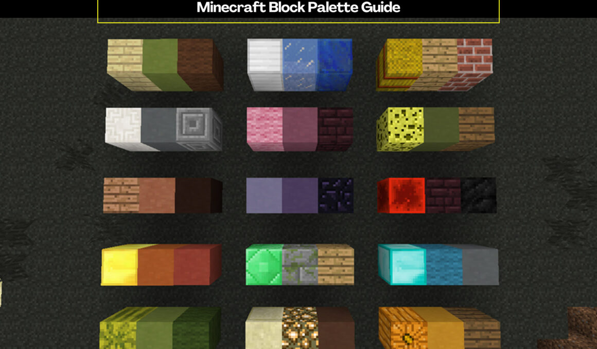
Best Minecraft color block combinations
And here are some examples in Minecraft as promised before!
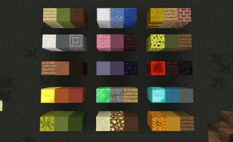
As you can see all the above-given block combinations follow our rule of taking colors that aren’t very dissimilar to each other.
There are some outliers like the gold and red terracotta block, but as you can see the colors still go together because in some scenarios contrasting colors are good, just don’t overdo them.
The Minecraft devs create entire block palettes for the player to use directly. For example, the prismarine blocks are very similar to each other in color, and when you build with them you get a very nice looking build.
More Minecraft Guides: